The Dodo Micropub - Social & Content
Background
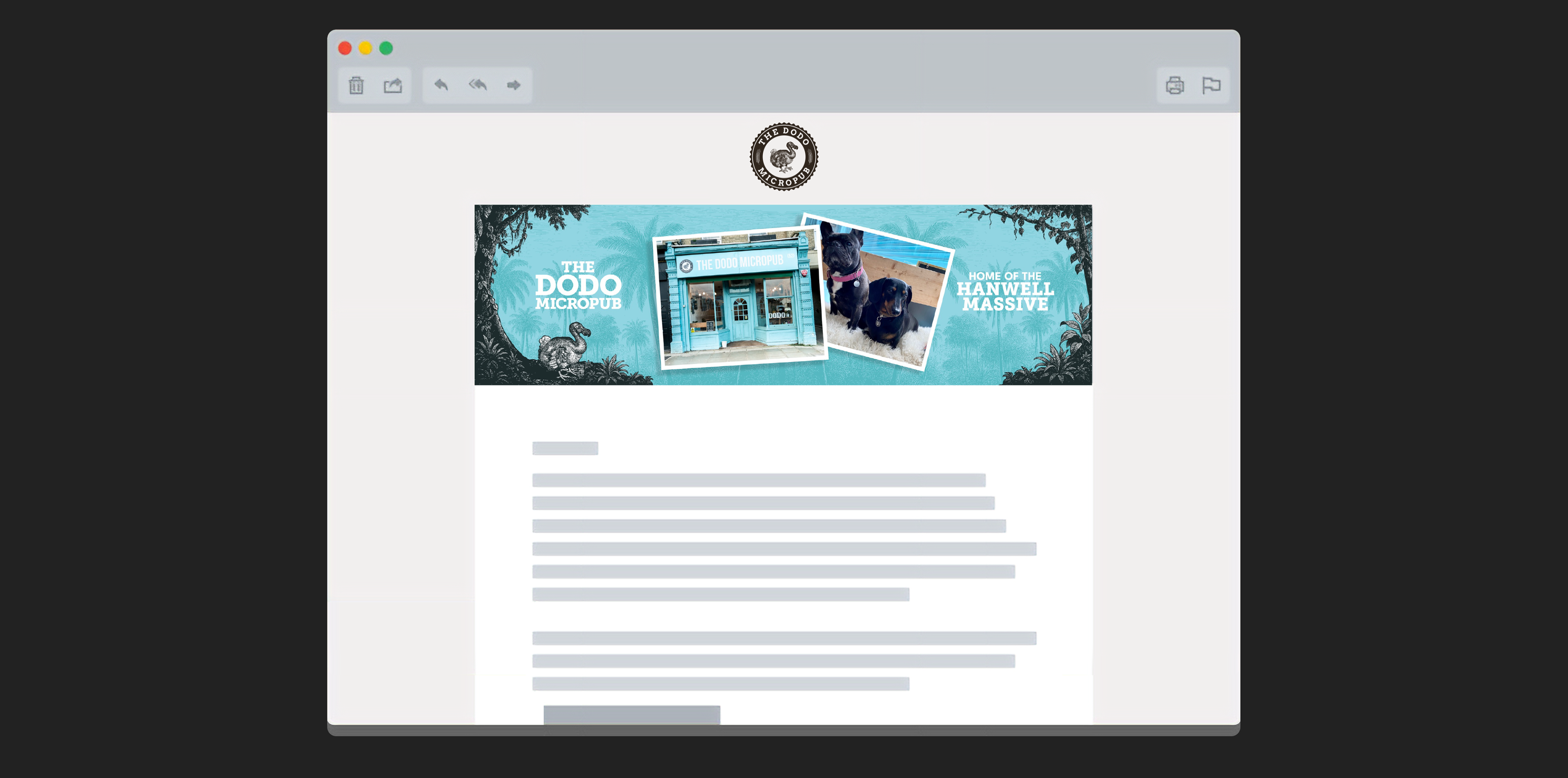
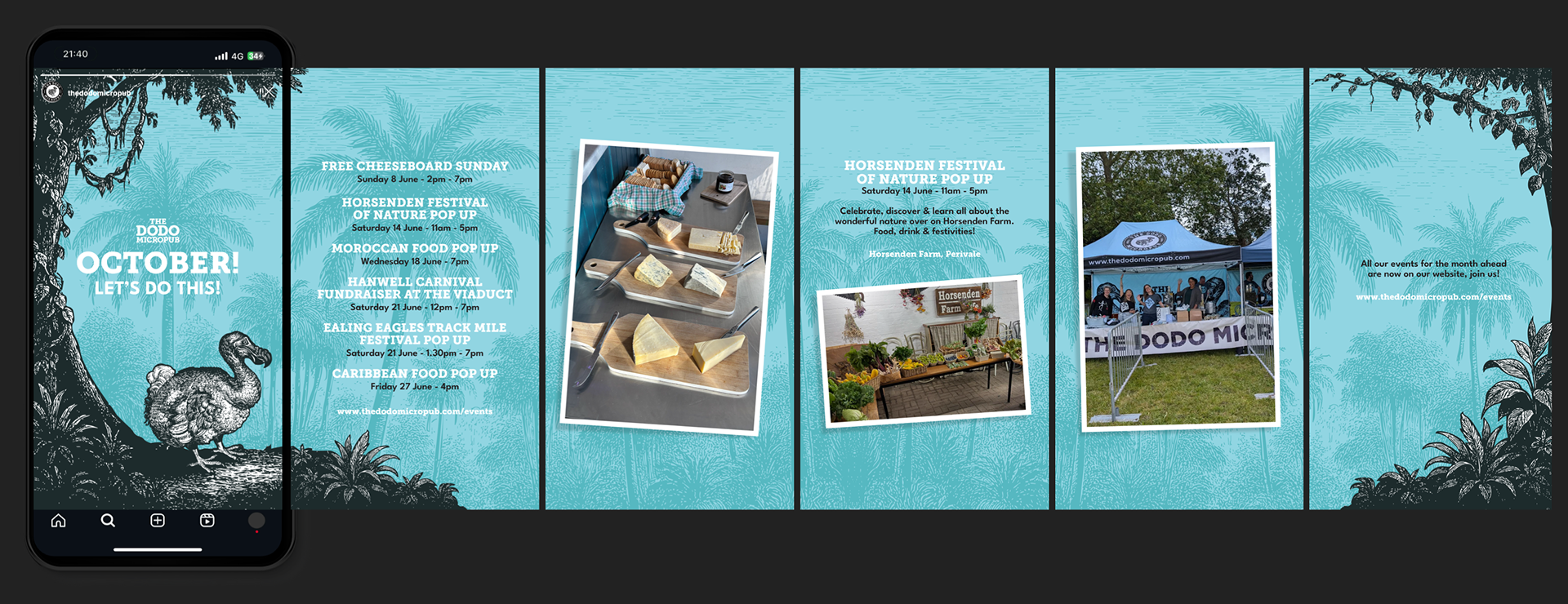
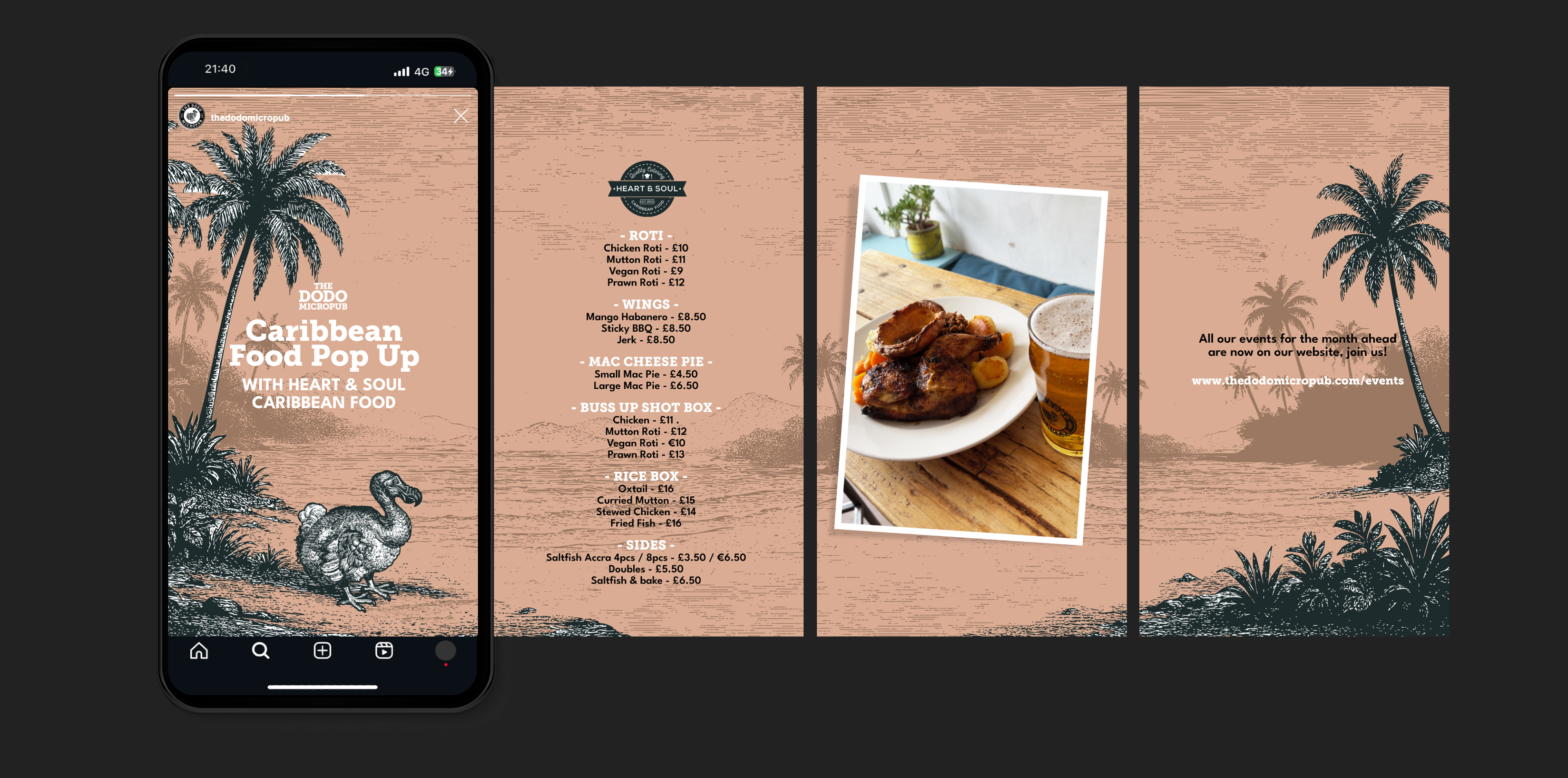
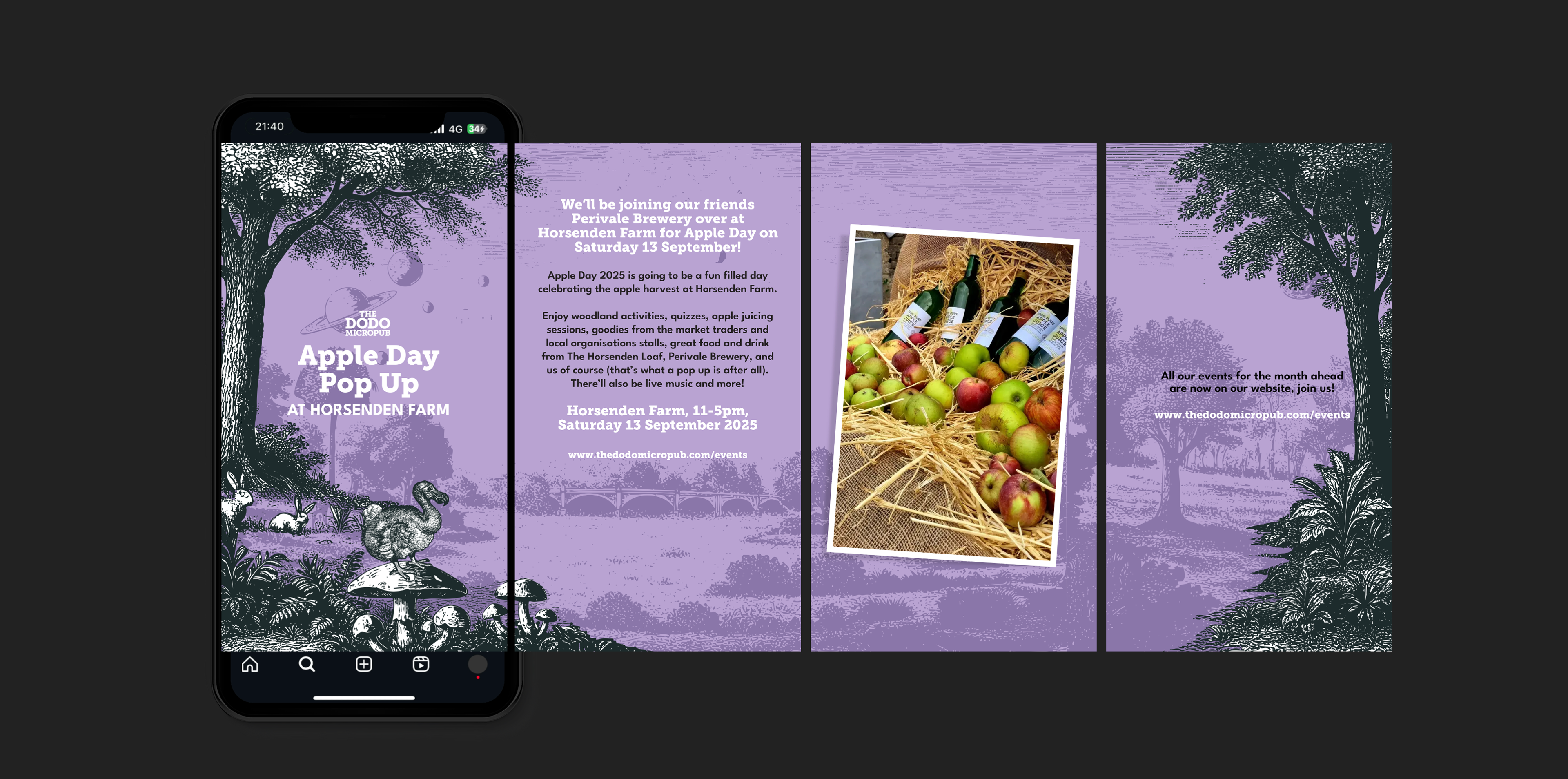
Create Social and email header templates for The Dodo Micropub in Hanwell, London, to announce upcoming news and events, food collabs, and other relevant content about the pub.
Idea & Execution
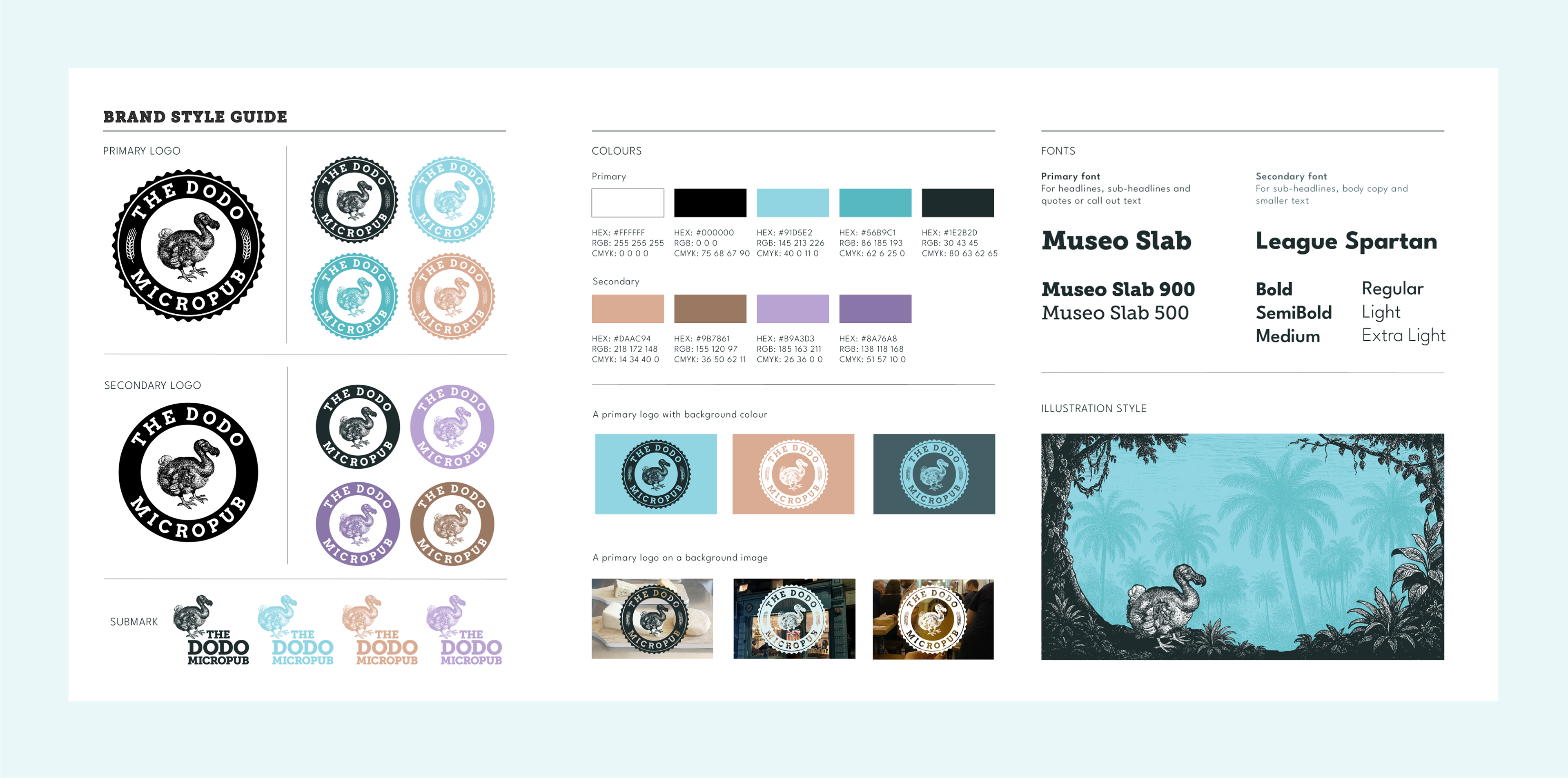
Using the existing logo, we expanded on the brand identity with new colours and fonts, and created worlds where the Dodo could be seen living his best life, on the beach, in the jungle, and in Hanwell, the home of the pub - all inspired by the Natural History illustration style used in old Botanical and Biology Books. I worked closely with the client to ensure they were taken on the journey and felt part of the process. The final designs were then taken into Canva as templates, so it was modular, could be used over a longer period of time, and they could build emailers, Instagram Carousels, and Stories that could be customisable as and when they needed them.
Reach Social Marketing - Logo, Corporate Identity
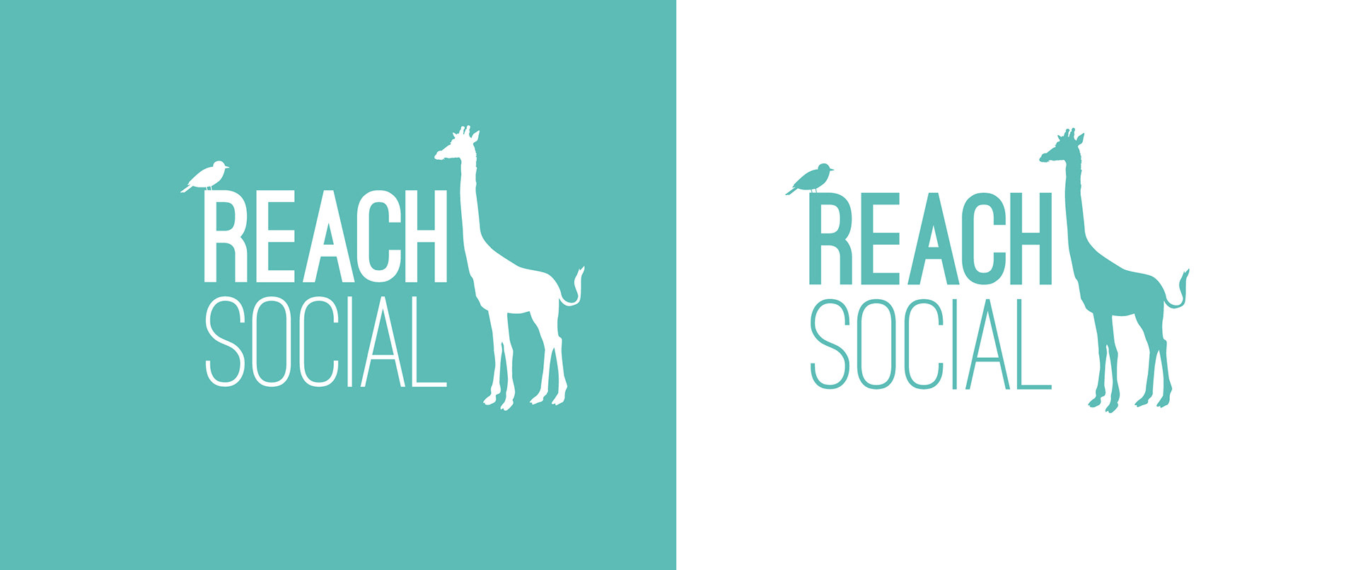
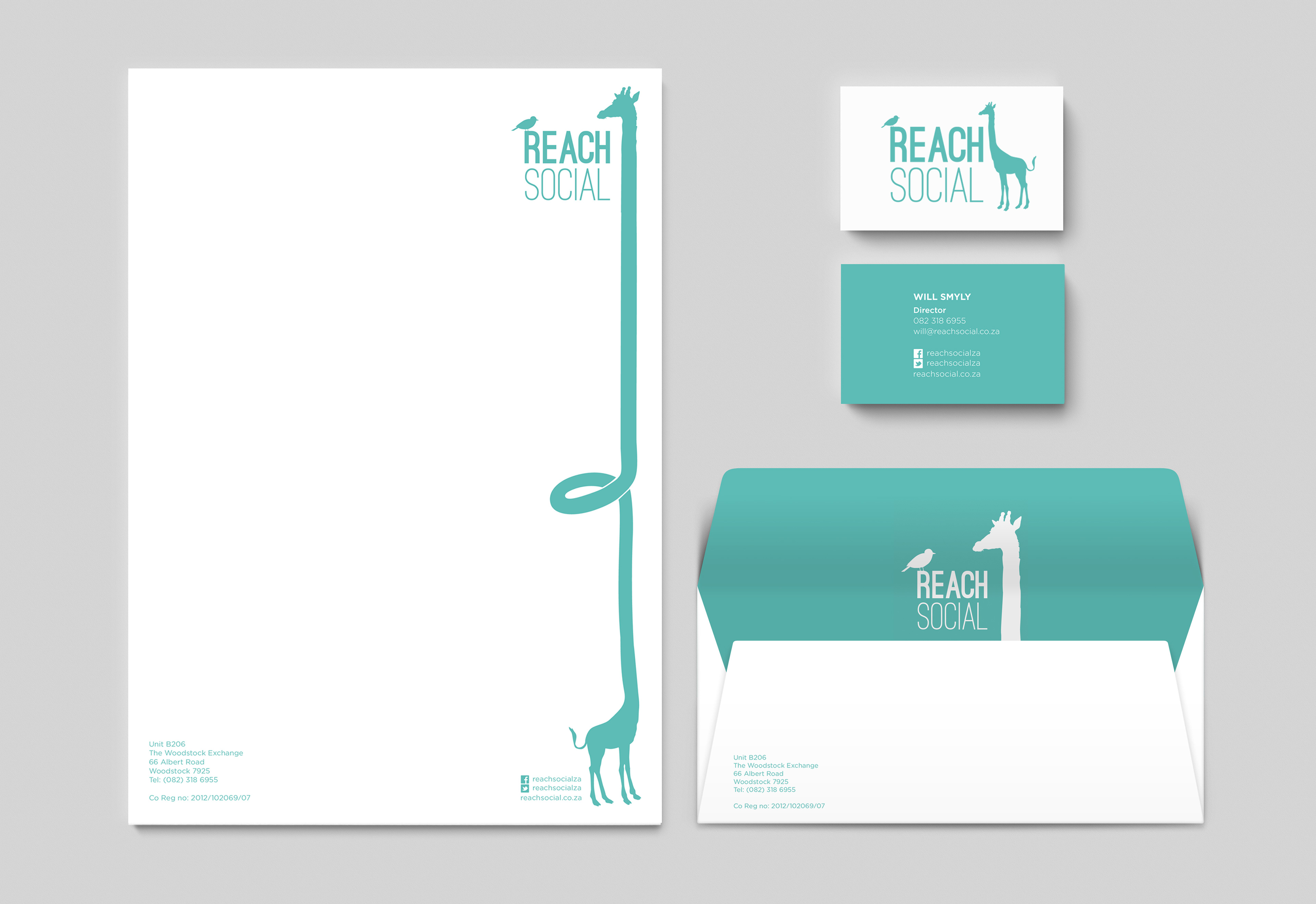
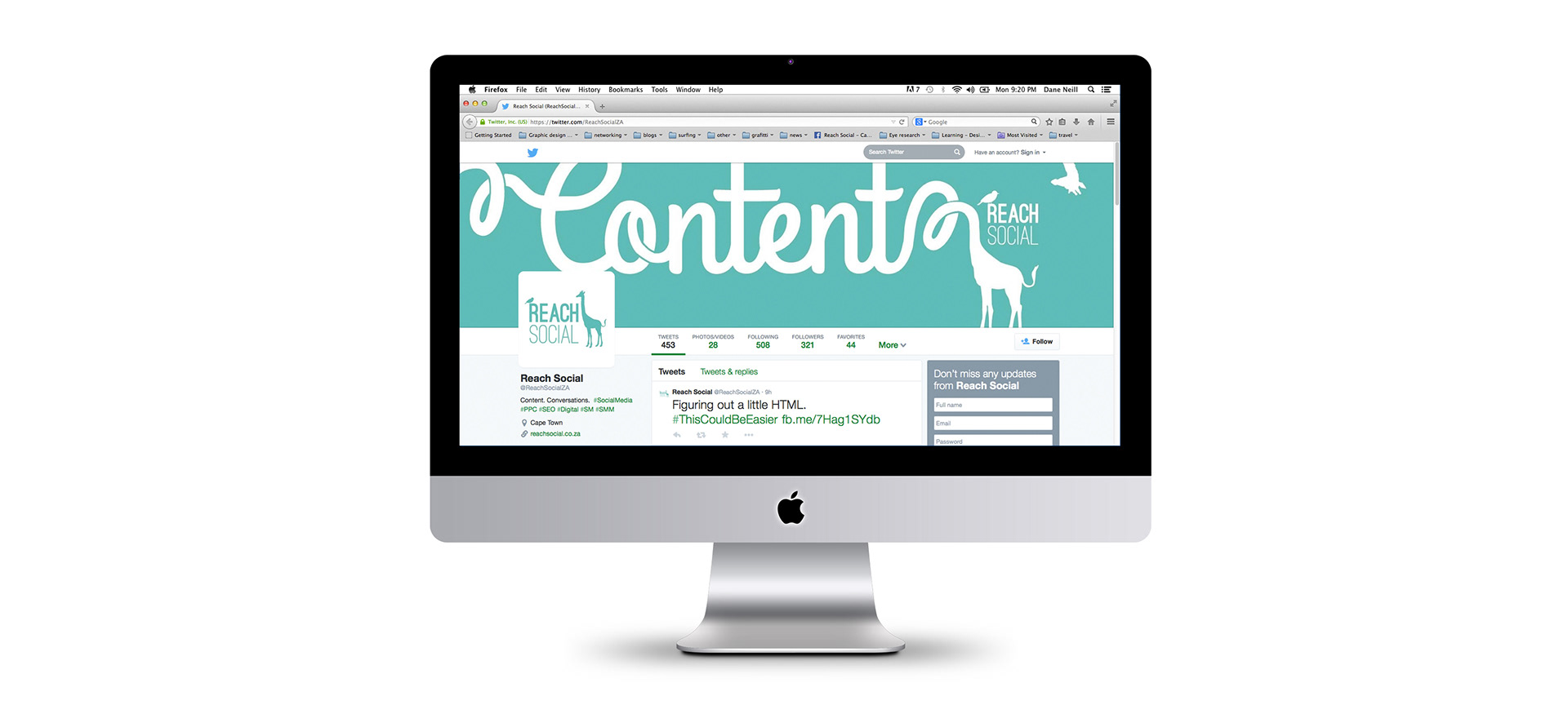
Design of the logo and corporate identity of Reach Social, a digital Marketing agency based in Cape Town. The logo was modernised to better suit the digital market.
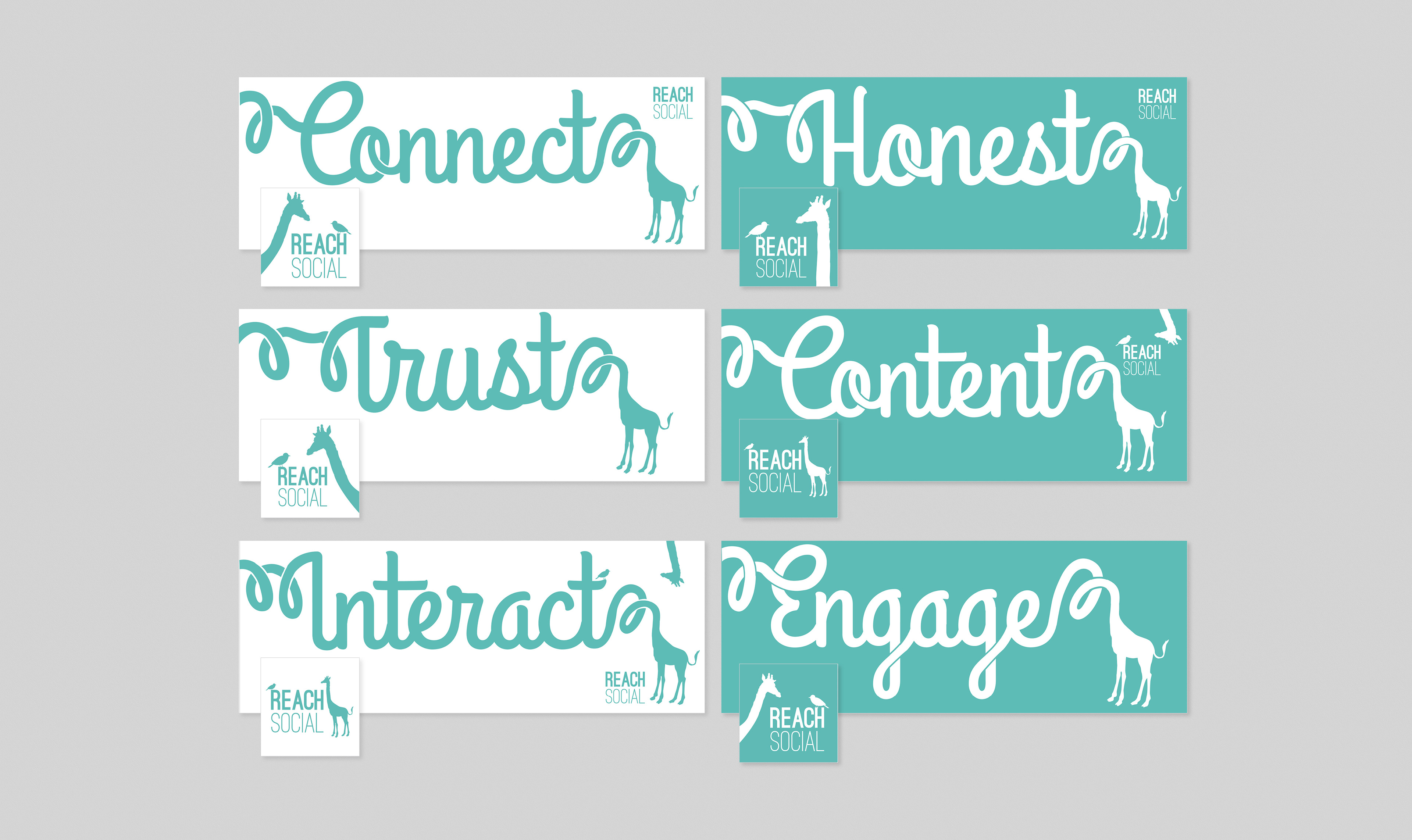
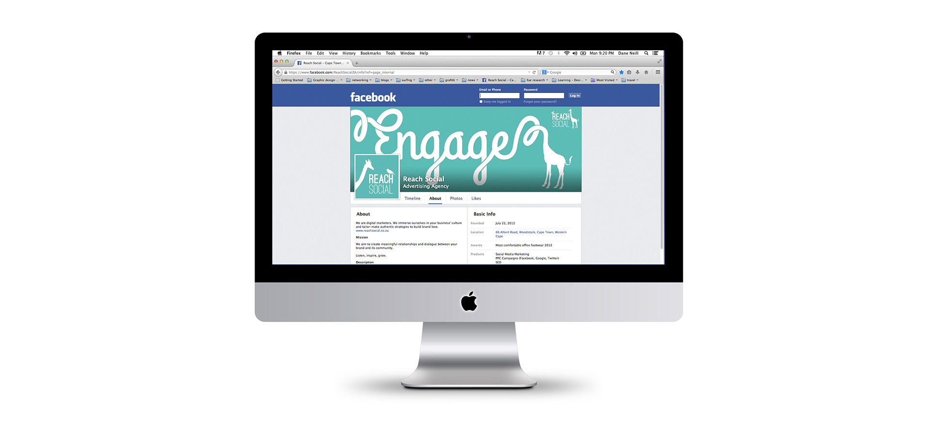
The redesign kept the giraffe and bird, elements of the previous CI, as the main characters throughout. They can be seen interacting with one another, always in a conversation. The Facebook and Twitter cover and profile pictures use keywords based on the business's values, all written with the giraffes long reaching neck.
Valkyrie Productions - Logo, Corporate Identity
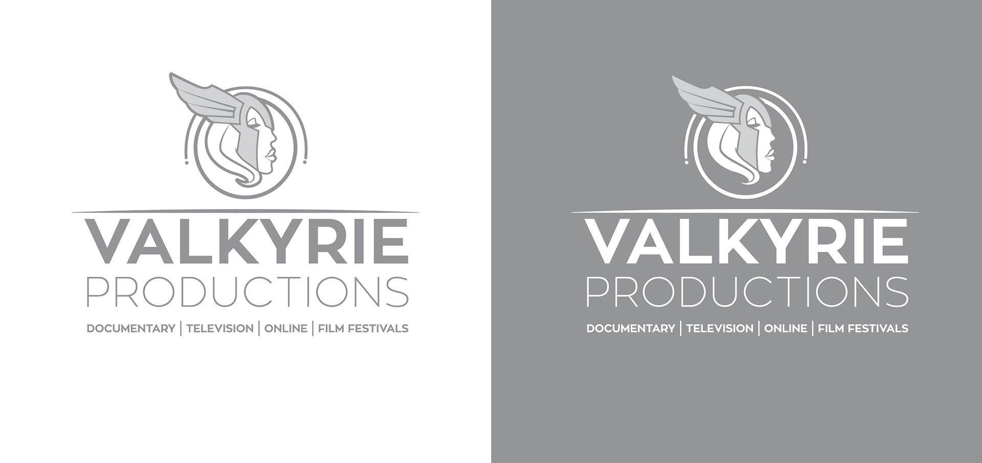
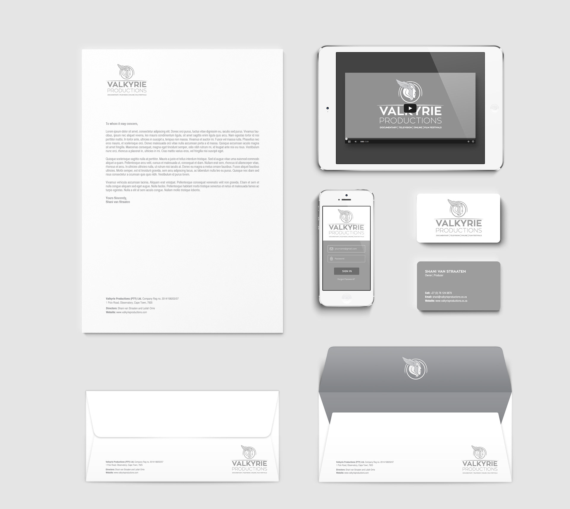
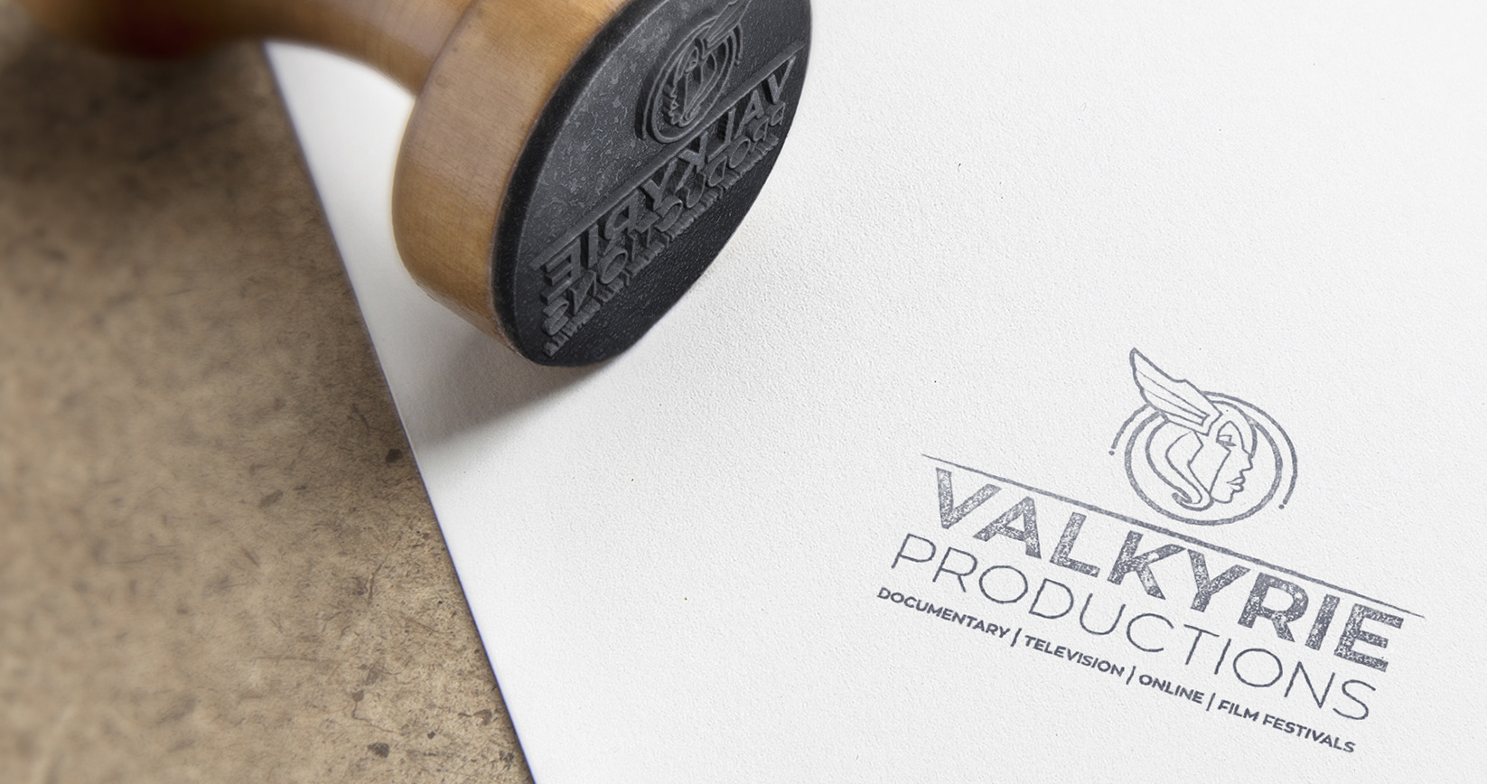
Design the logo and corporate identity for Valkyrie Productions, a female-owned film and production company from Cape Town. The logo was based on the name Valkyrie, an ancient female Viking goddess who came down to earth to gather the slain soldiers off the battlefield. The CI was kept very clean and sophisticated while still having a feminine feel.
Van Ryn's Brandy - Branding, Corporate Identity
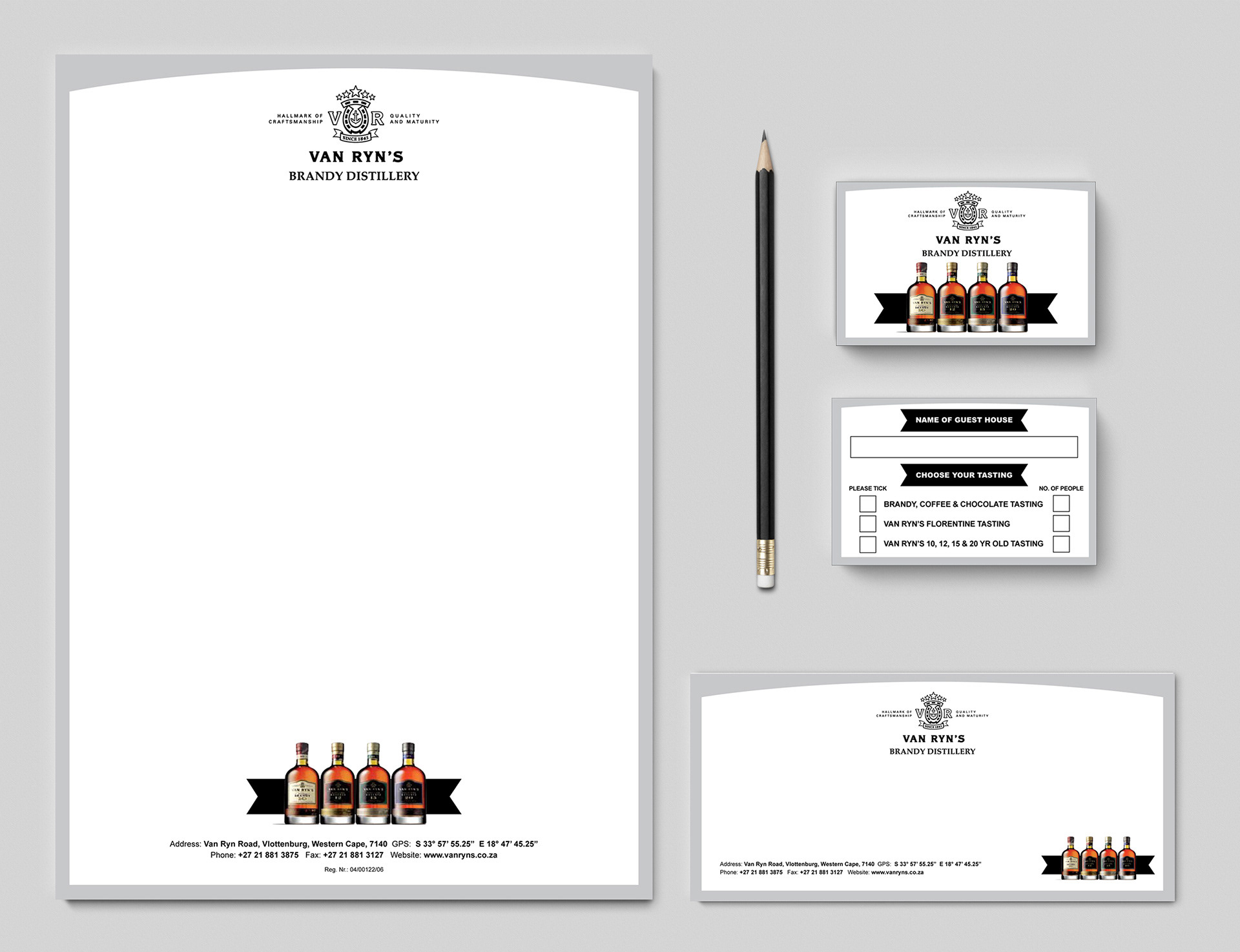
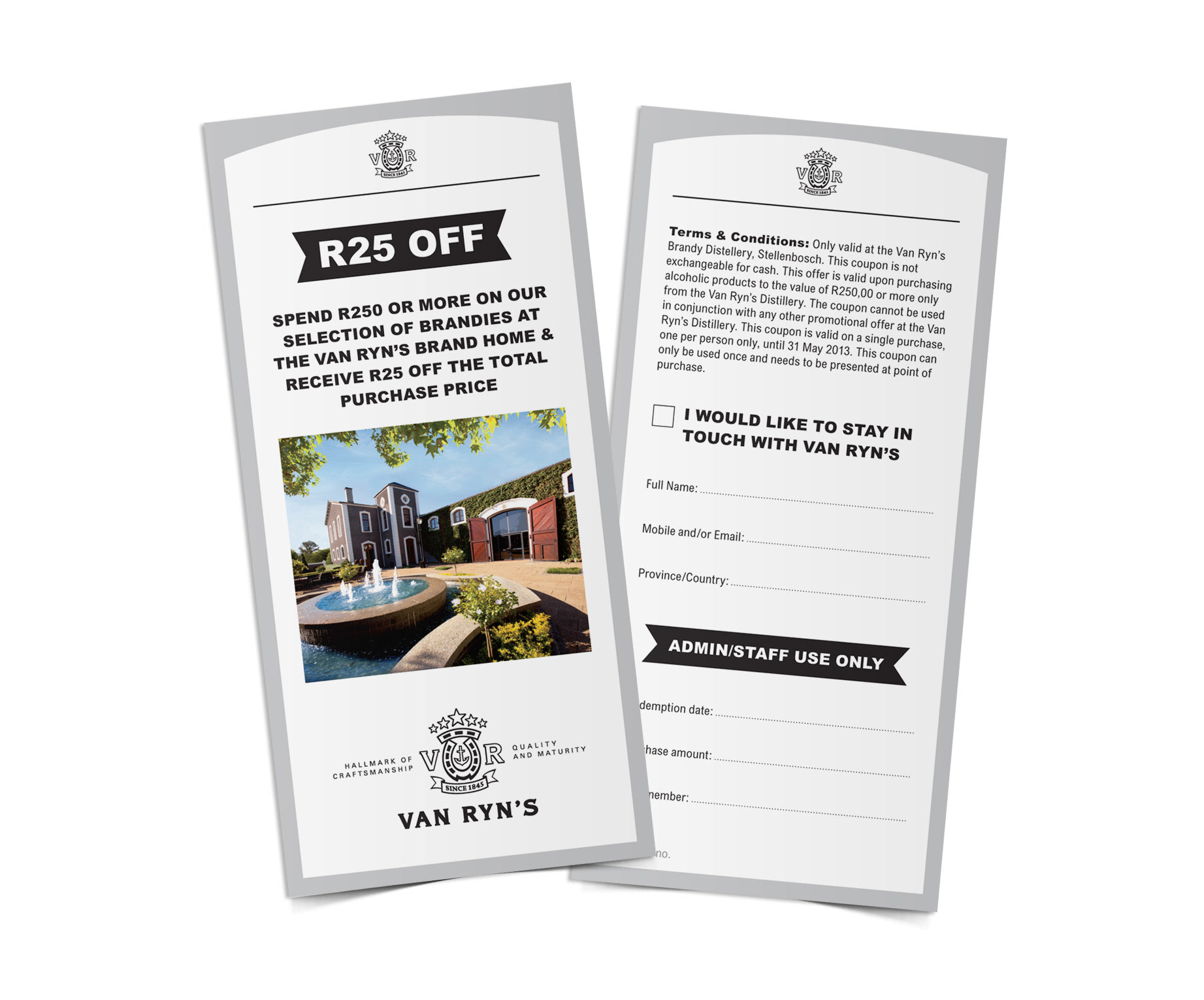
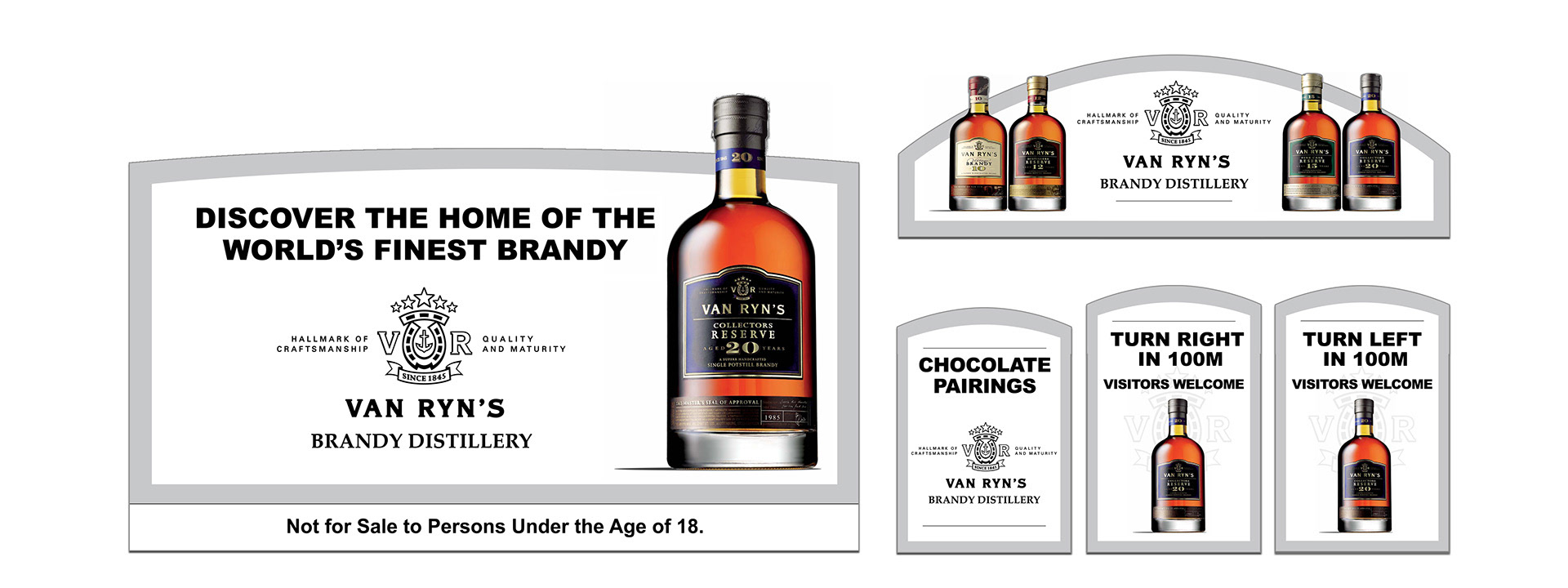
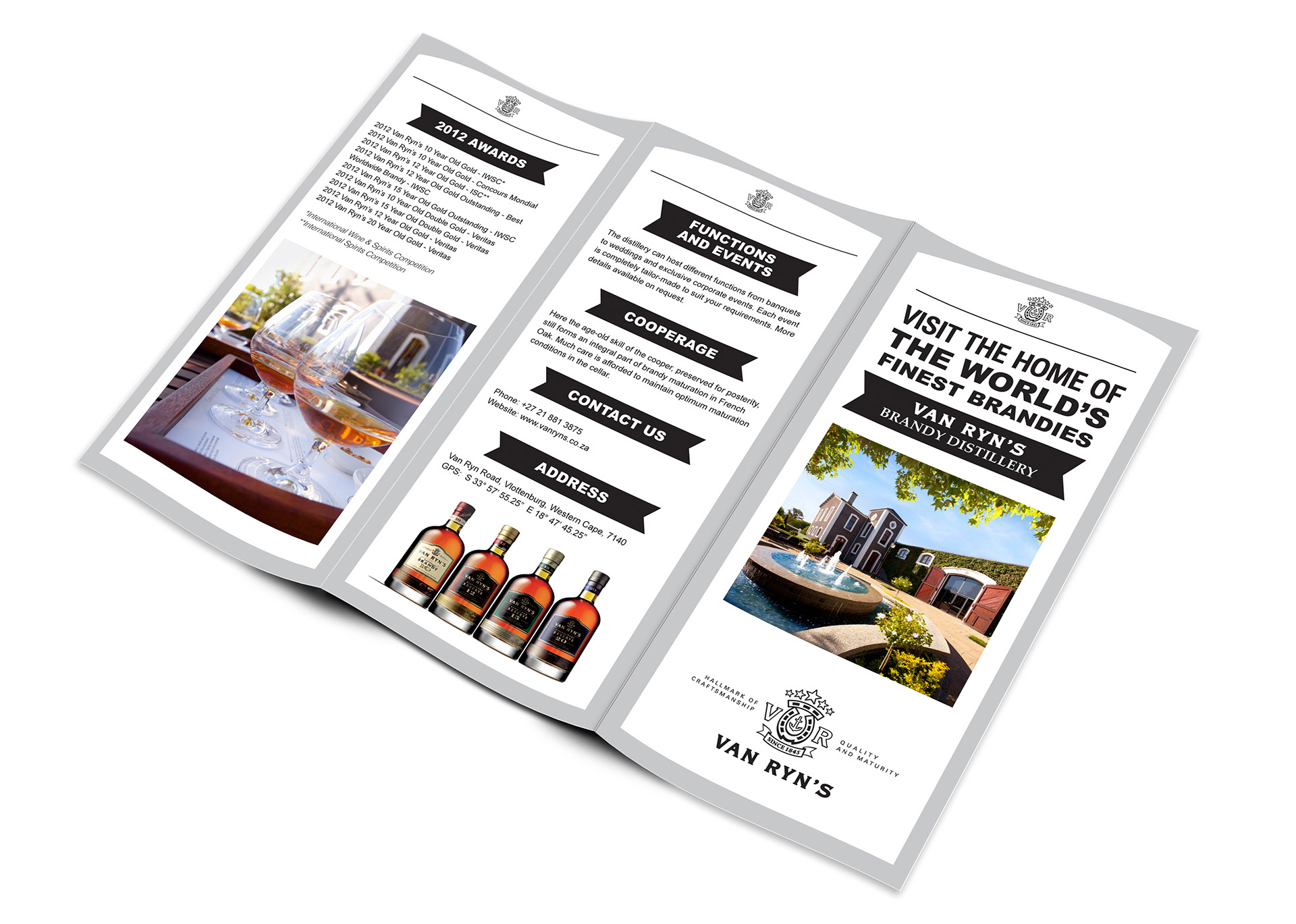
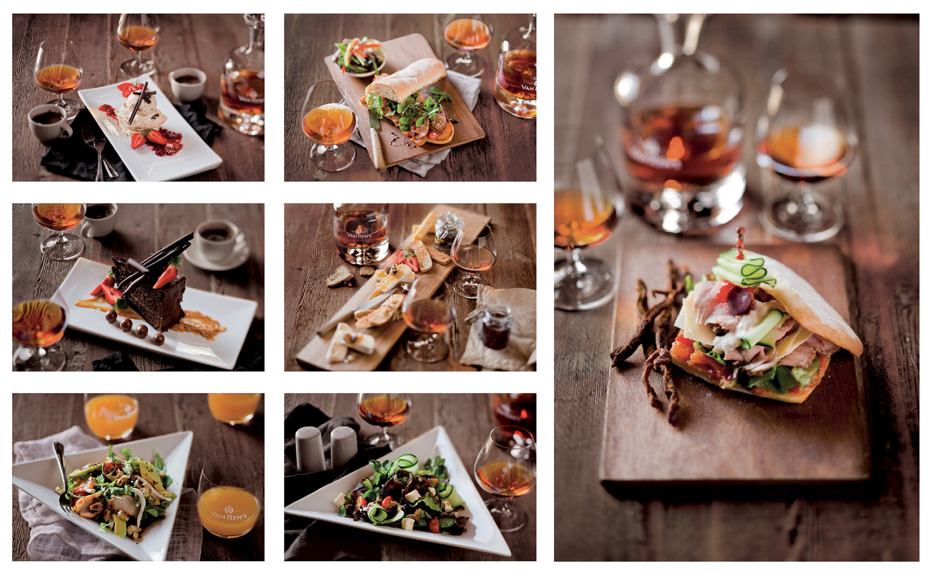
Upgrade the corporate identity and look & feel for the Brand Home of Van Ryn’s Brandy, a Distillery in Stellenbosch and South Africa’s oldest brandy producer dating back to 1845. I was the Art Director for the photography seen throughout. The food was shot by Dirk Pieters, a renowned Cape Town food photographer. The Brand home itself was shot by Simon Barnes, and the 3D rendering of the barrels was done by a local company and conceptualized by me.
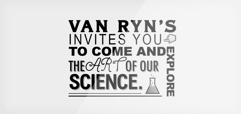
It was all created to highlight the beauty of the Van Ryn’s brand home. The home of the world’s finest brandies. A modern look was used while bringing in elements of the brands existing logo. The Cape Dutch style arch found in the logo and surrounding area was used as a border and device to contain the logo and other content, the colours were kept simple with strong emphasis on the full colour photography, art directed by me. Various elements were done, including stationery (letterhead, compliment slip), tasting cards, brochures, emailers, flyers, signage, and billboards.
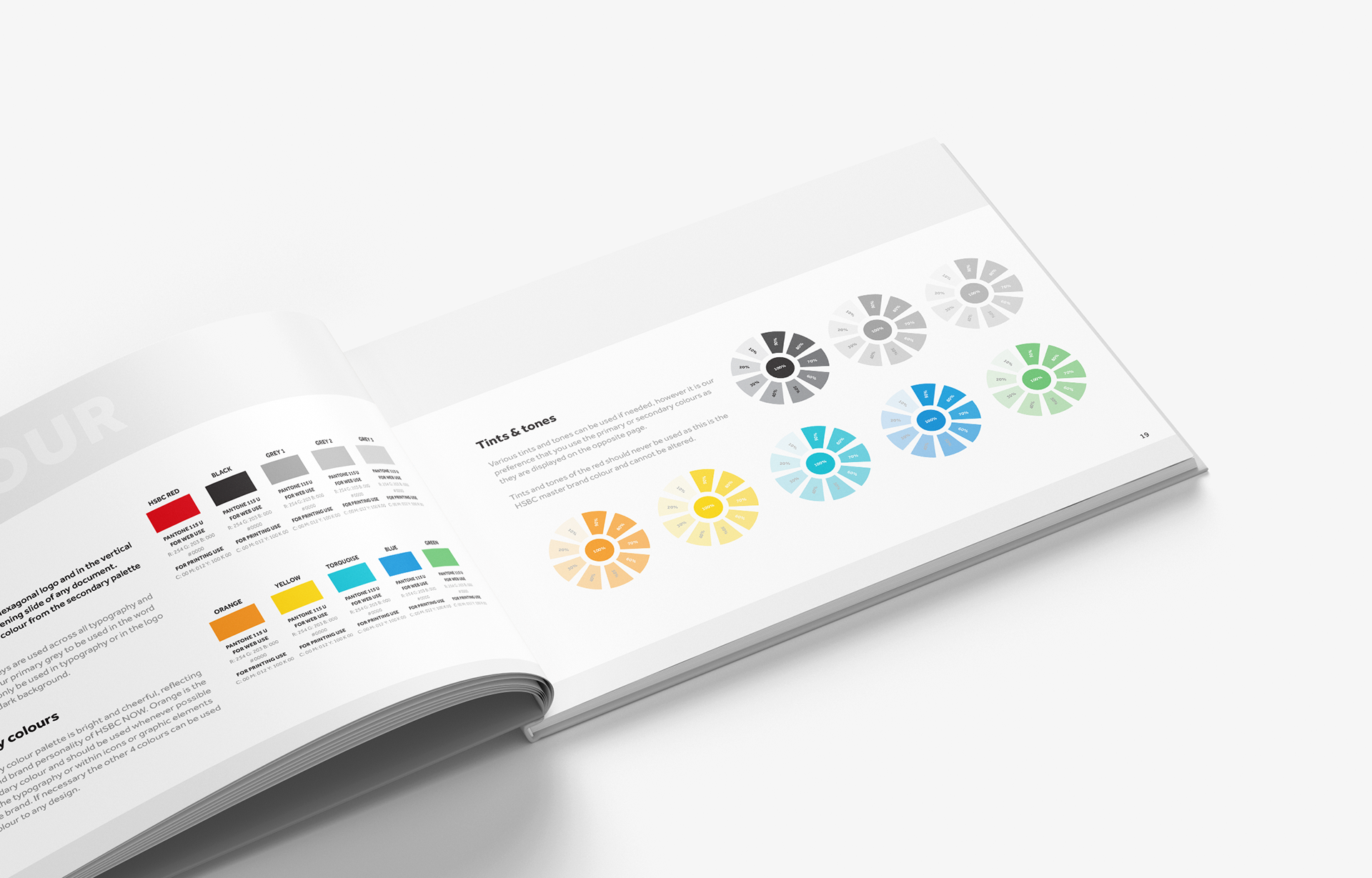
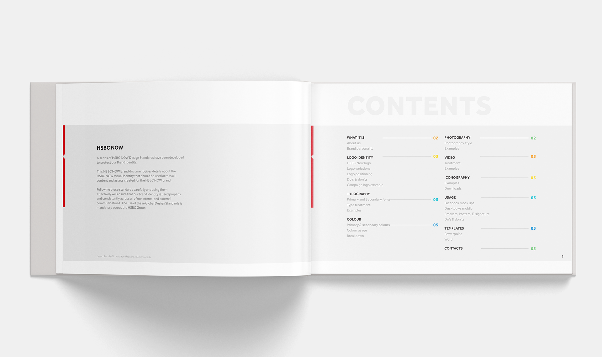
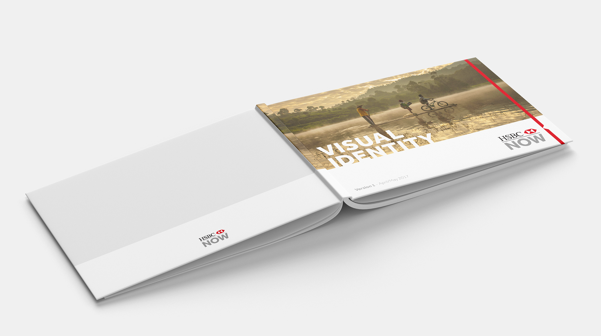
HSBC NOW - Employee social platform
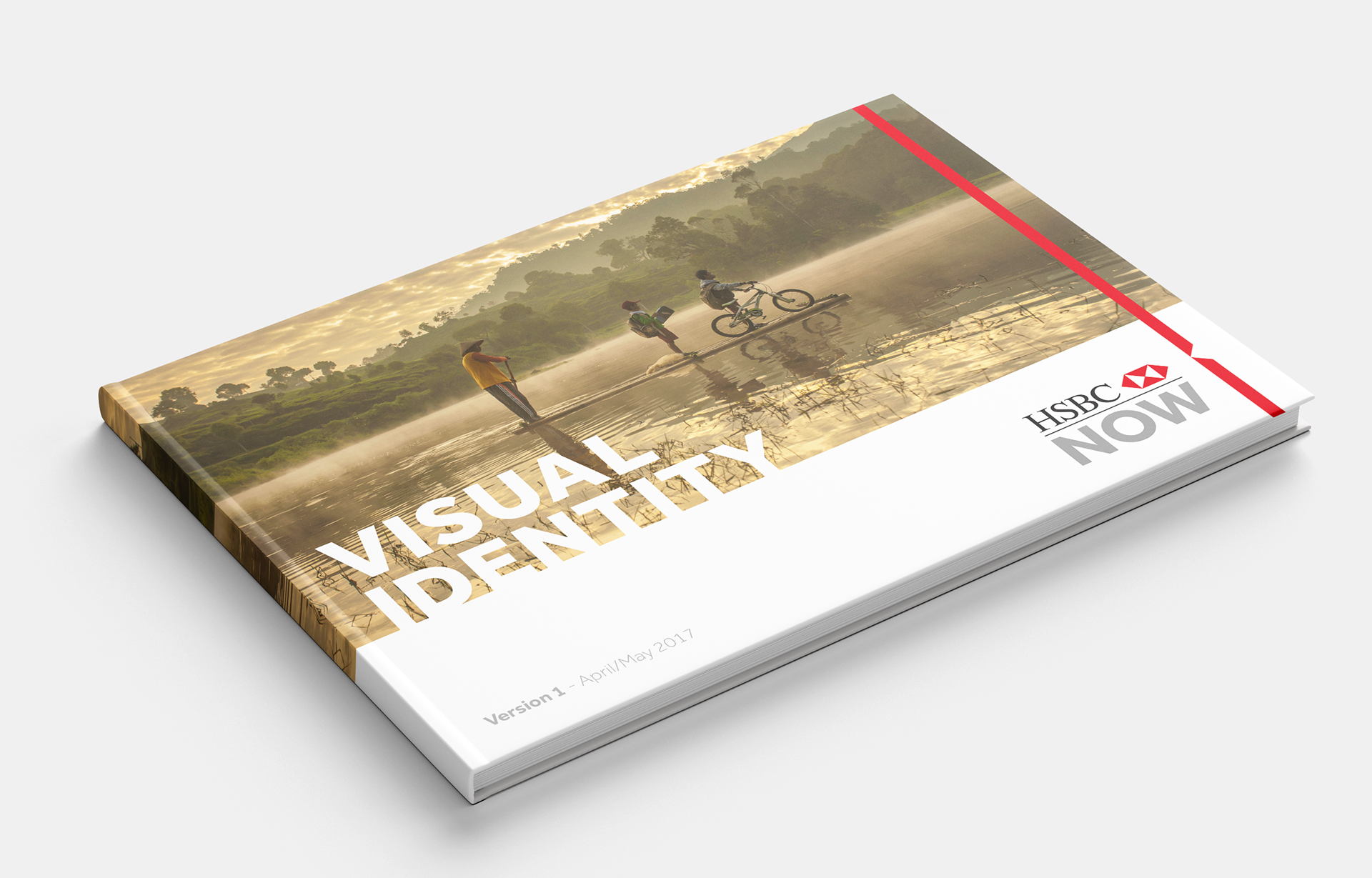
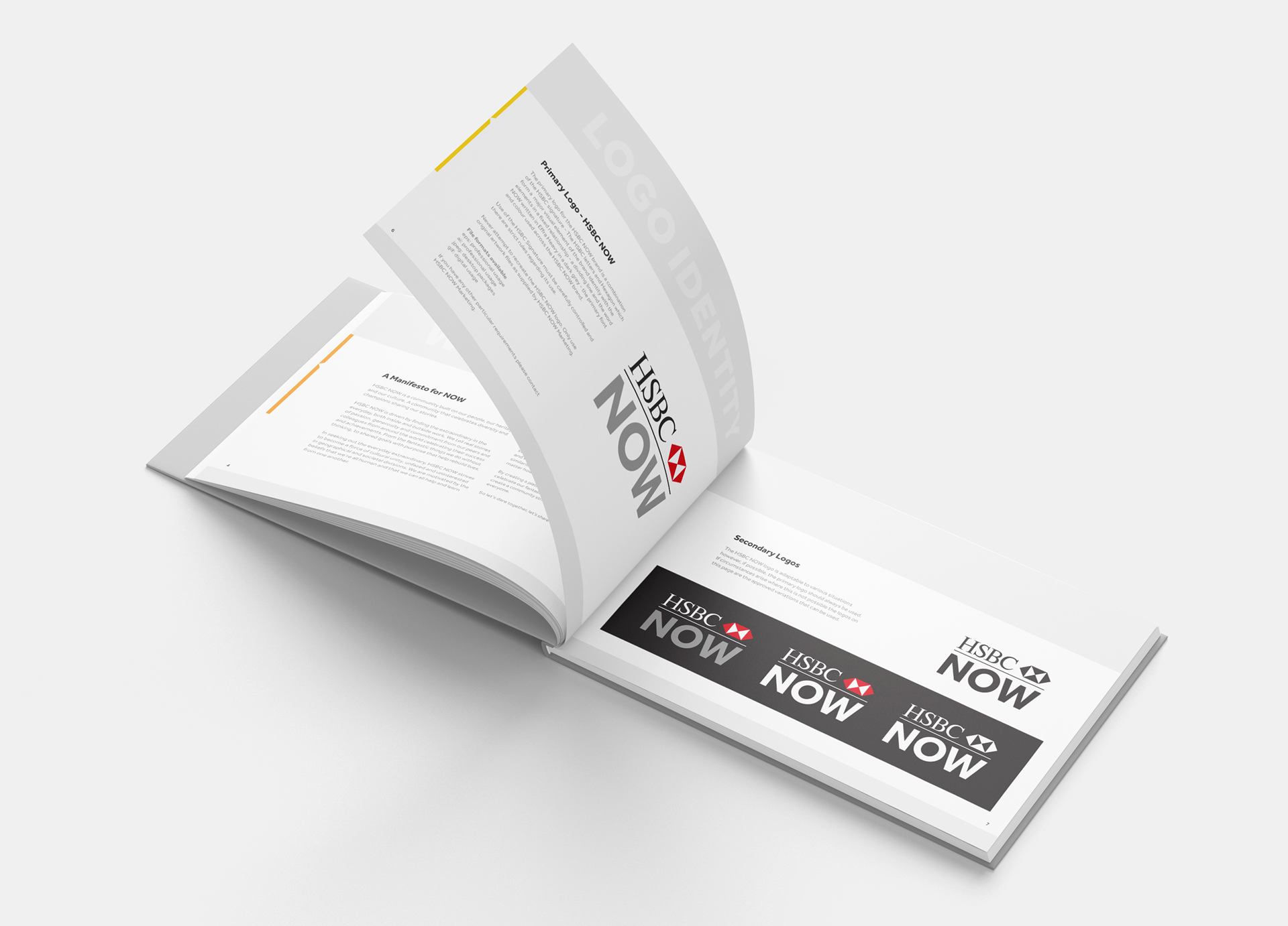
Design of the HSBC employee engagement platform primarily on social media - HSBC NOW. Guidelines and various marketing communications were created. for the launch, along with working on the content that followed.
FlexiFoil Kitesurfing UK - Branding and collateral
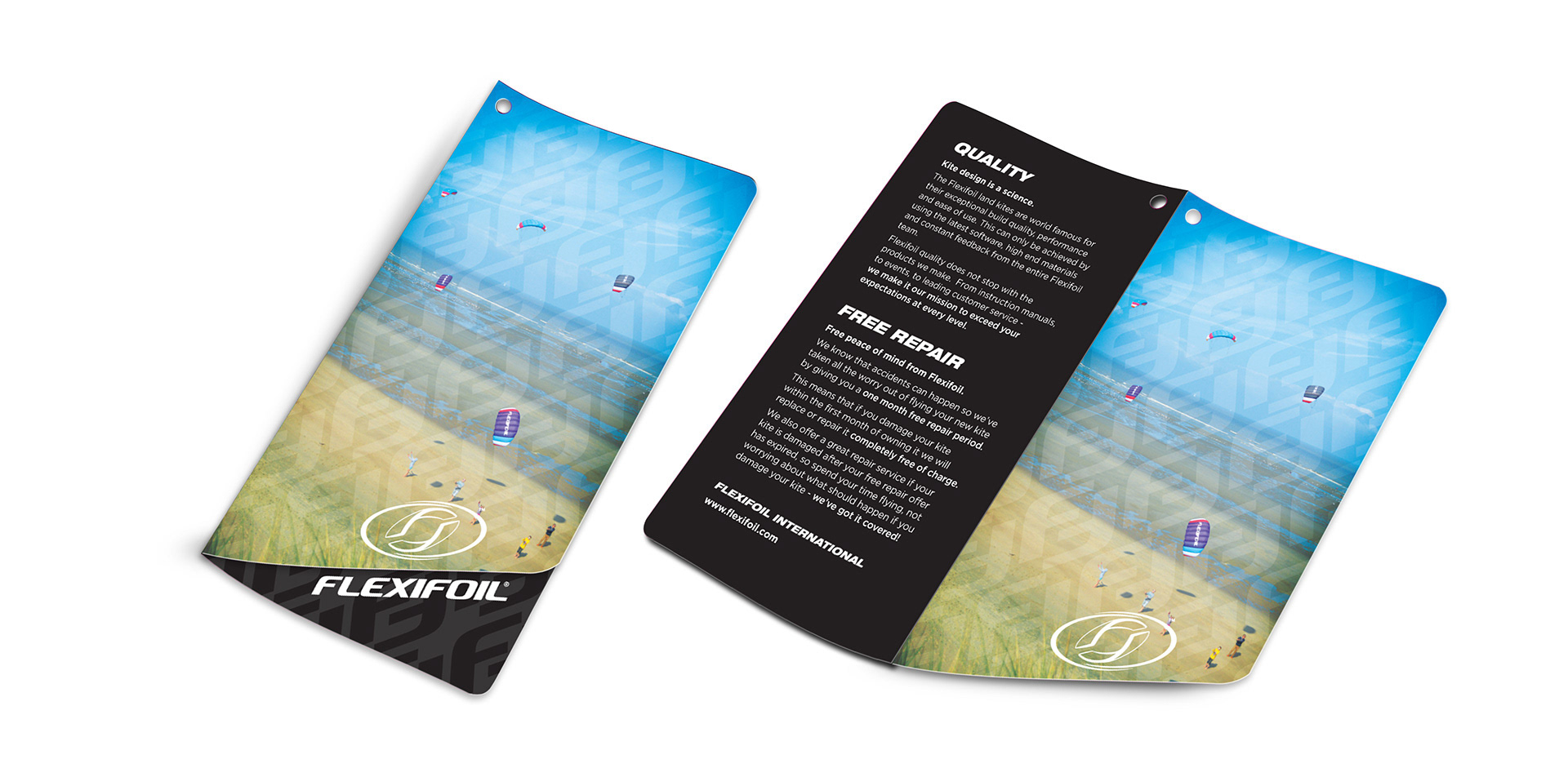
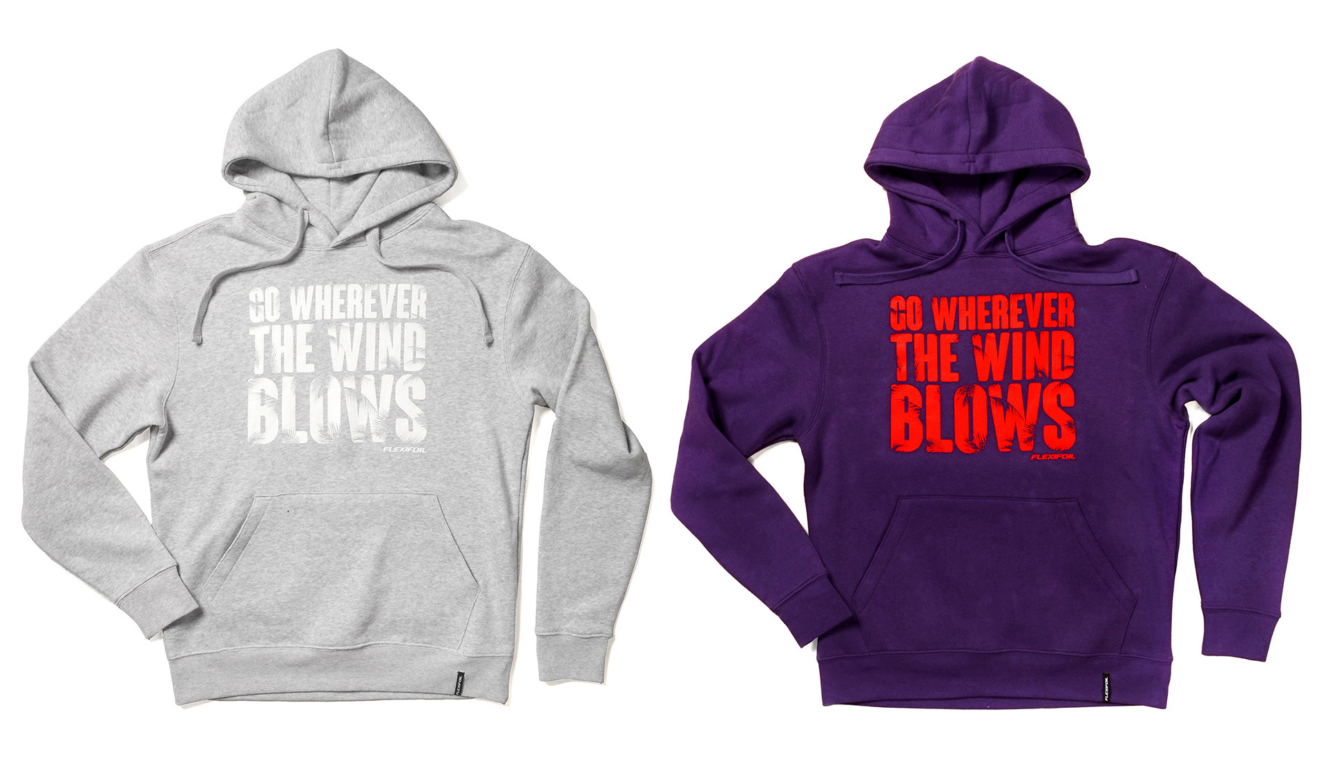
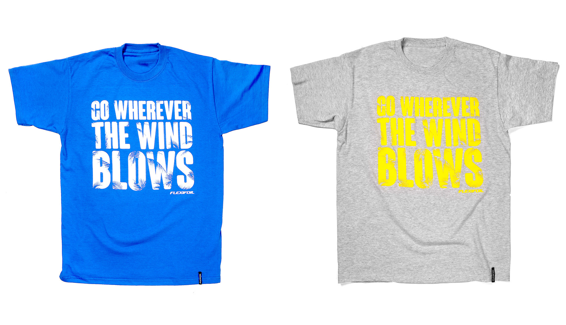
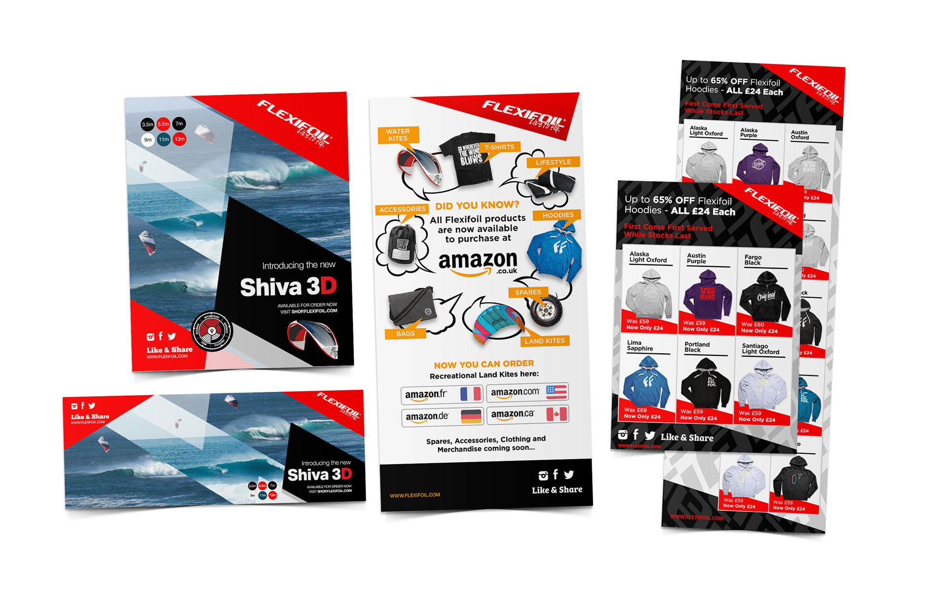
Flexifoil Kitesurfing - Brochures, swing tags, emailers, typography and textile design across hoodies and t-shirts for the English Kitesurfing brand, Flexifoil.

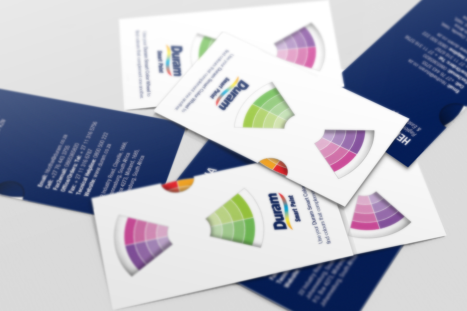
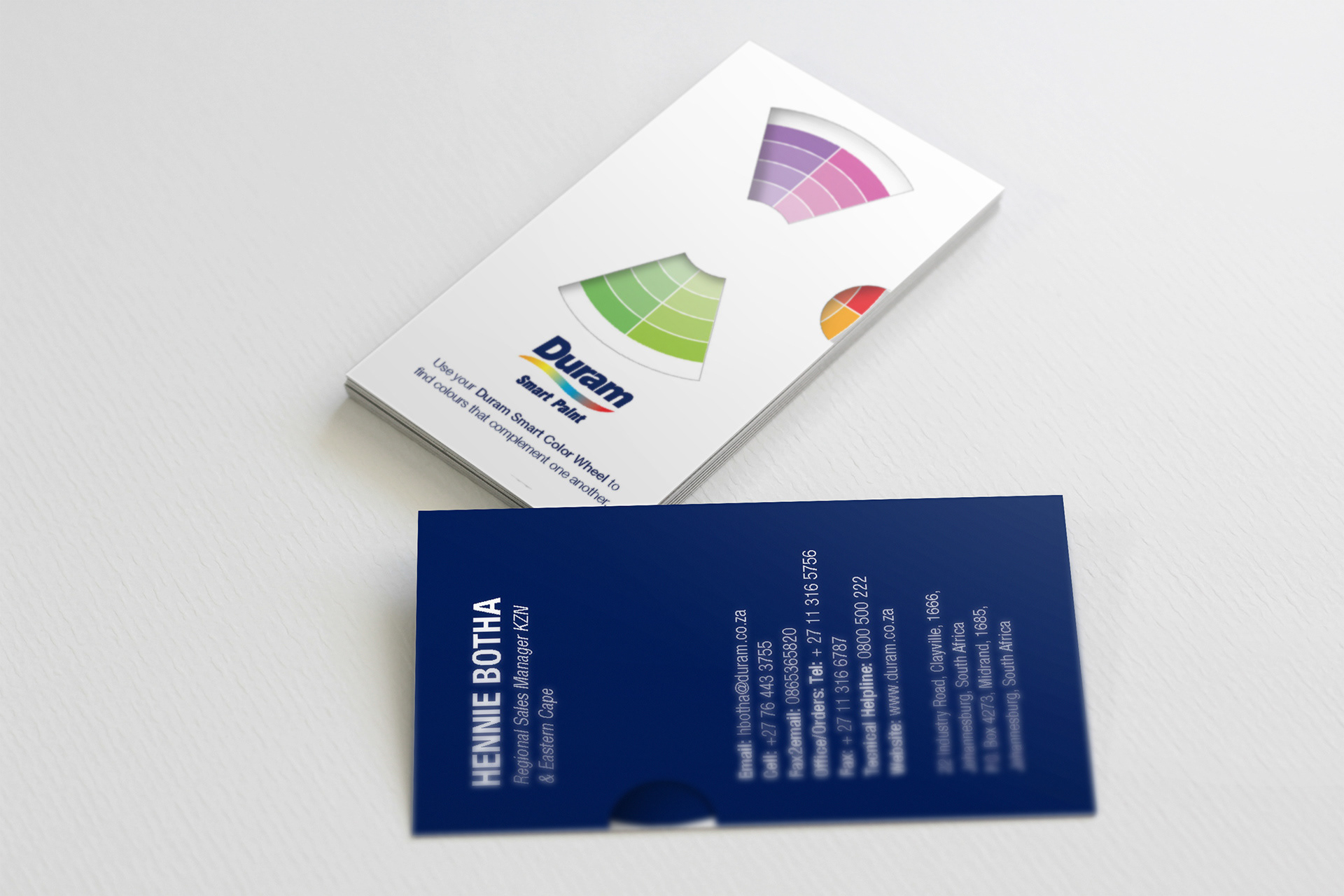
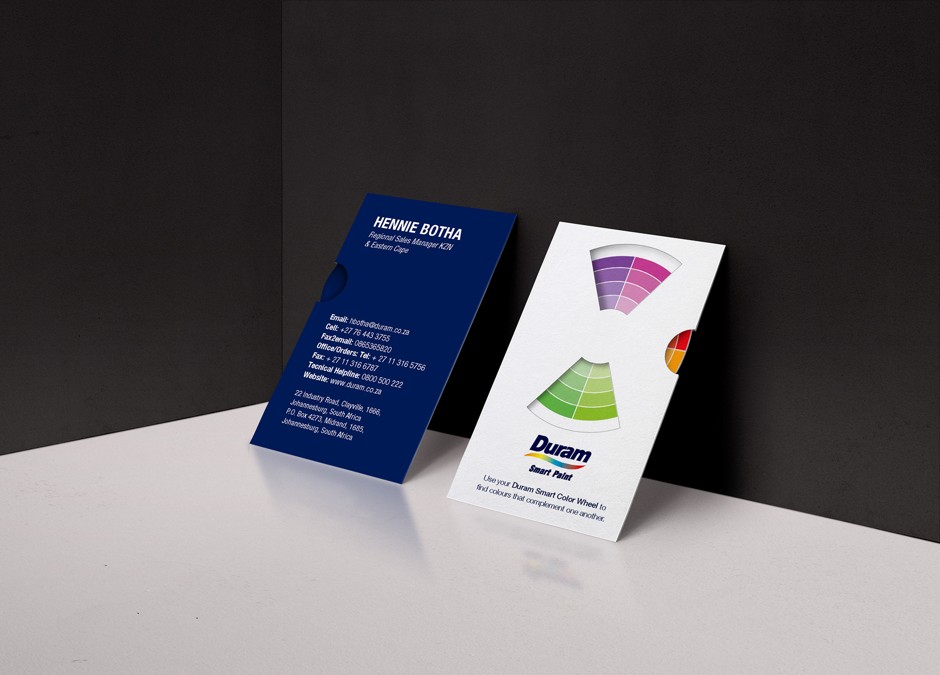
Duram 'Smart Paint' - Business Cards
Concept for a business card for the brand managers of Duram Paint, a South African paint manufacturer, designed with a ‘Smart Color Wheel’ built into it to help consumers choose contrasting colors for their homes or furniture from the Duram Smart Paint Collection.